
Turning Point Behavioral Health Care Center
Solid support when and where you need it most.


During our decades long collaboration with Turning Point, Grillo Group has gained a deep understanding of the behavioral health center’s key stakeholders, services, achievements, and challenges.
As Turning Point has matured into an essential community resource, partner, and leader, we’ve helped to communicate the center’s strengths more effectively, to articulate the case for philanthropic support, and to add more effective signage, environmental branding, and visual appeal to the physical space.
In 2020, the impact of the COVID pandemic and a changing economy required a reshuffling of priorities in mental health care delivery. As a result, the State of Illinois allocated funds to Turning Point and select other organizations to deliver mobile crisis response services to the communities they serve.
This expansion of Turning Point’s crisis response capabilities combined with its continued growth highlighted the need to rearticulate and reposition the brand to most accurately represent Turning Point today.
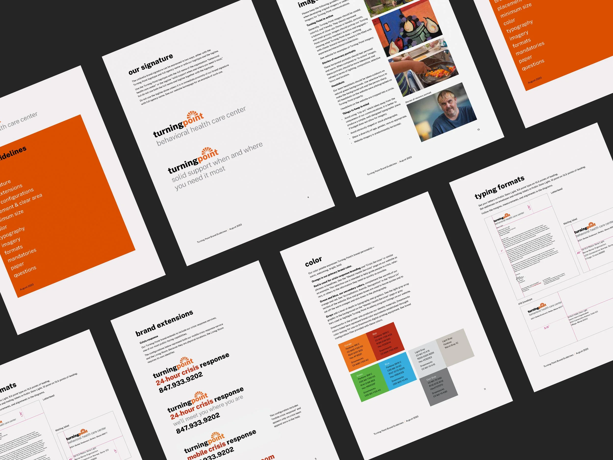
Based on extensive stakeholder research and a thorough competitive analysis, we developed new brand messaging and design elements to show Turning Point in action as experts, teachers, and community leaders along its many avenues of recovery and support.
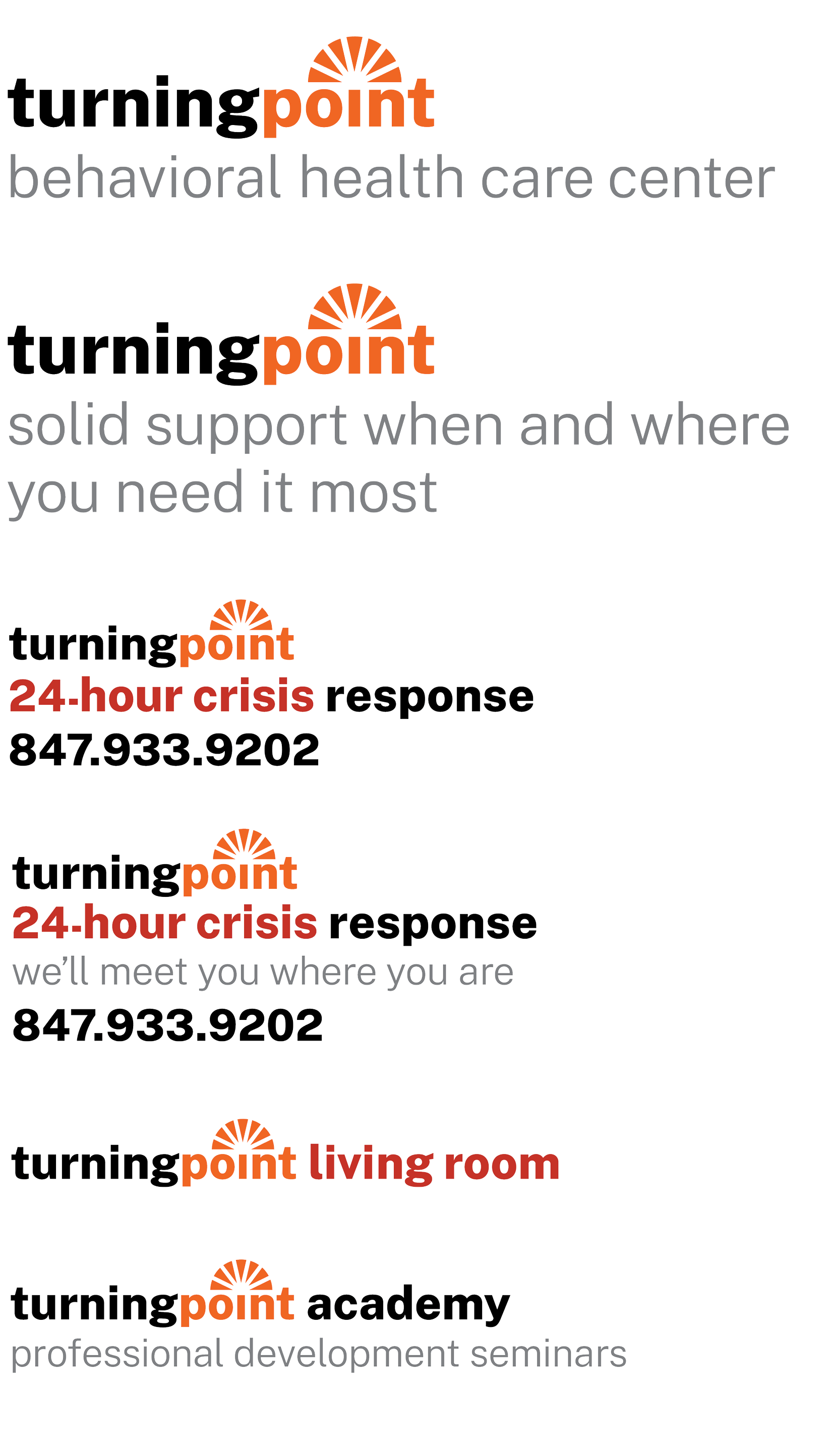
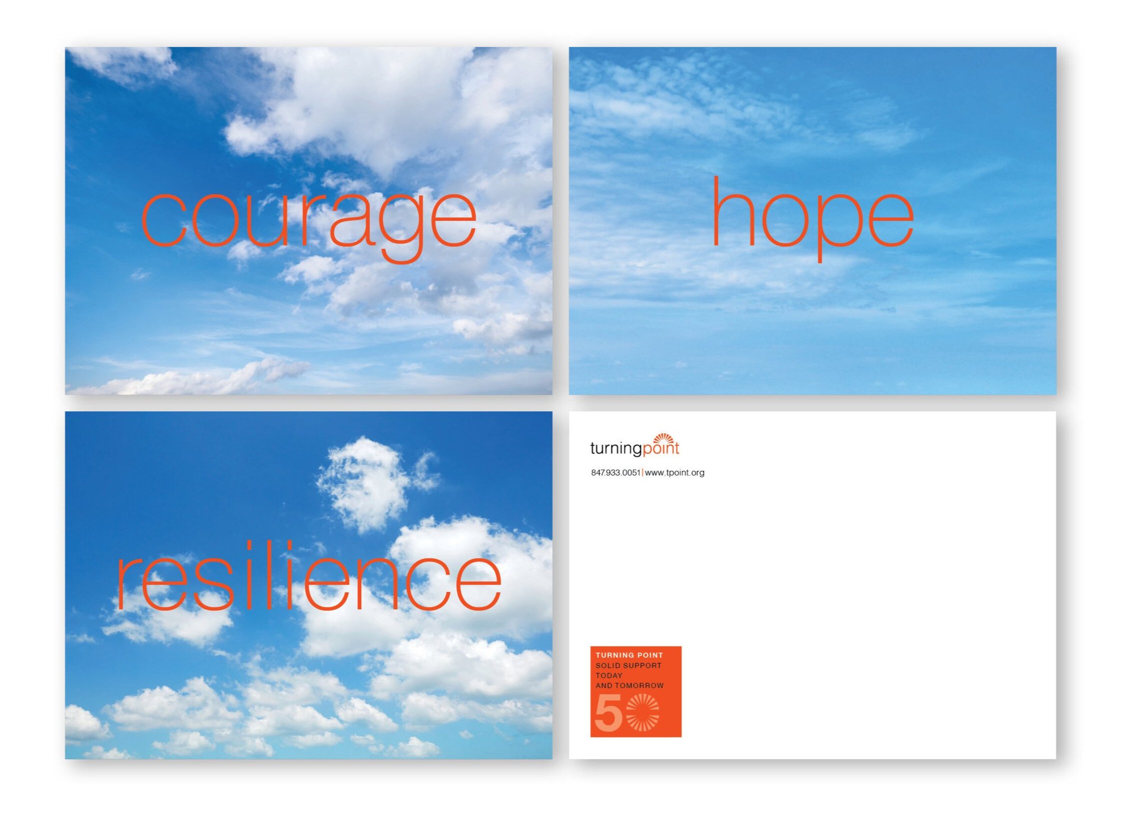
Rather than change the visual brand, we refreshed and refined it to take advantage of it’s equity, emphasize the center’s full name and to highlight the updated tagline, which reflects the expanded crisis response service offerings.
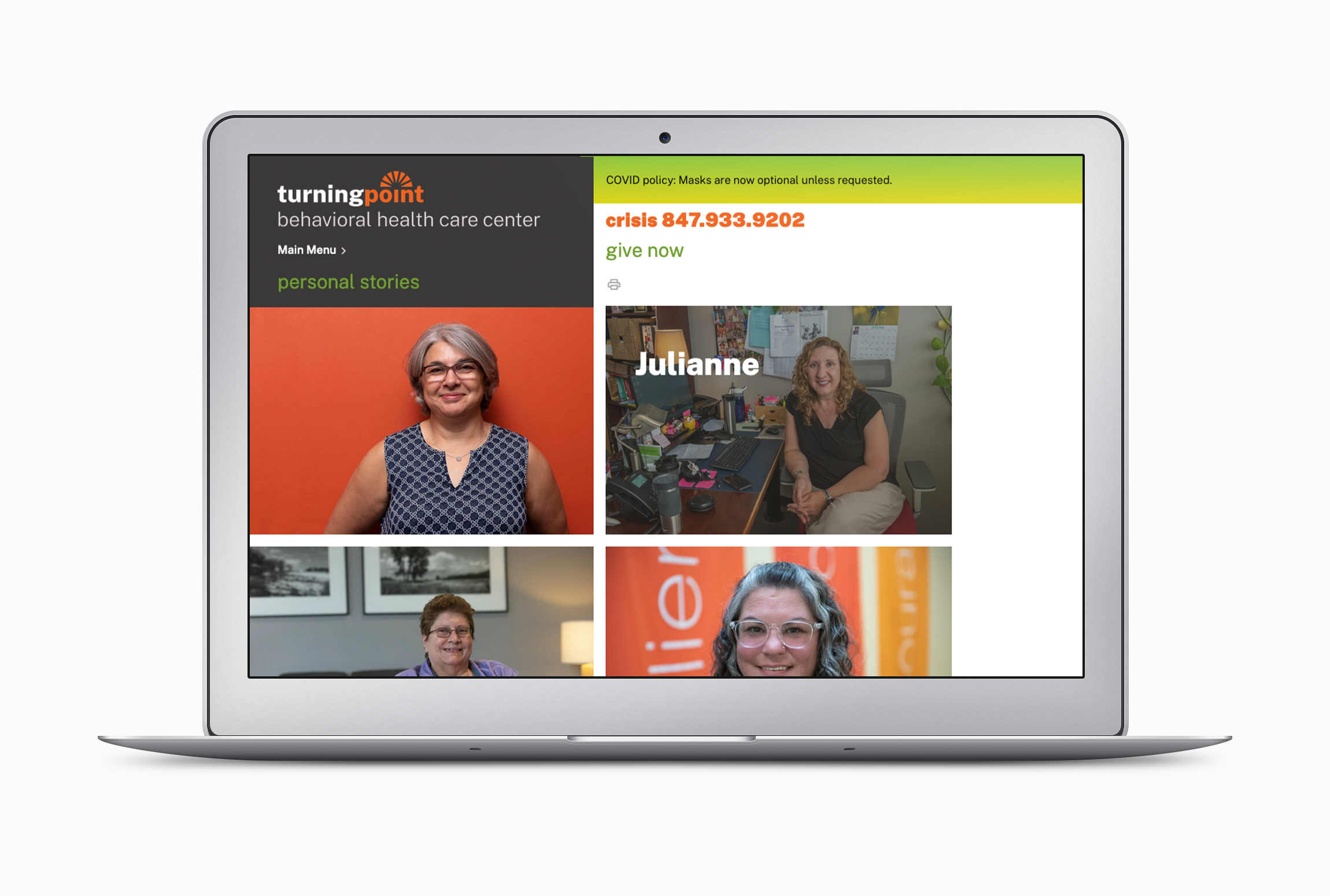
We also created a new website to facilitate fast, easy access for key stakeholders—individuals in crisis or need, referral sources, community partners, service providers, staff, policy makers, and donors—to the information and services they seek.
Twenty years ago, Grillo Group revolutionized our community mental health center branding. Their creativity and professionalism stood the test of time and the words and images they developed still feel fresh and accurate today. So, this year—as we expand our services and deepen our community partnerships—we knew that only Maria Grillo should lead the reconsideration of our branding. Once again, she and her colleagues studied our current programs and services, talked with our stakeholders, discussed new program innovations with our team, and developed a new set of brand communications that is compelling and enlivening, yet still faithful to our values and our history. Maria’s best skill is the way she blends her keen intellect with her openness, understanding, and compassion for our work.
Ann Fisher Raney, AM, LCSW, Chief Executive Officer, Turning Point Behavioral Health Care Center
Client success
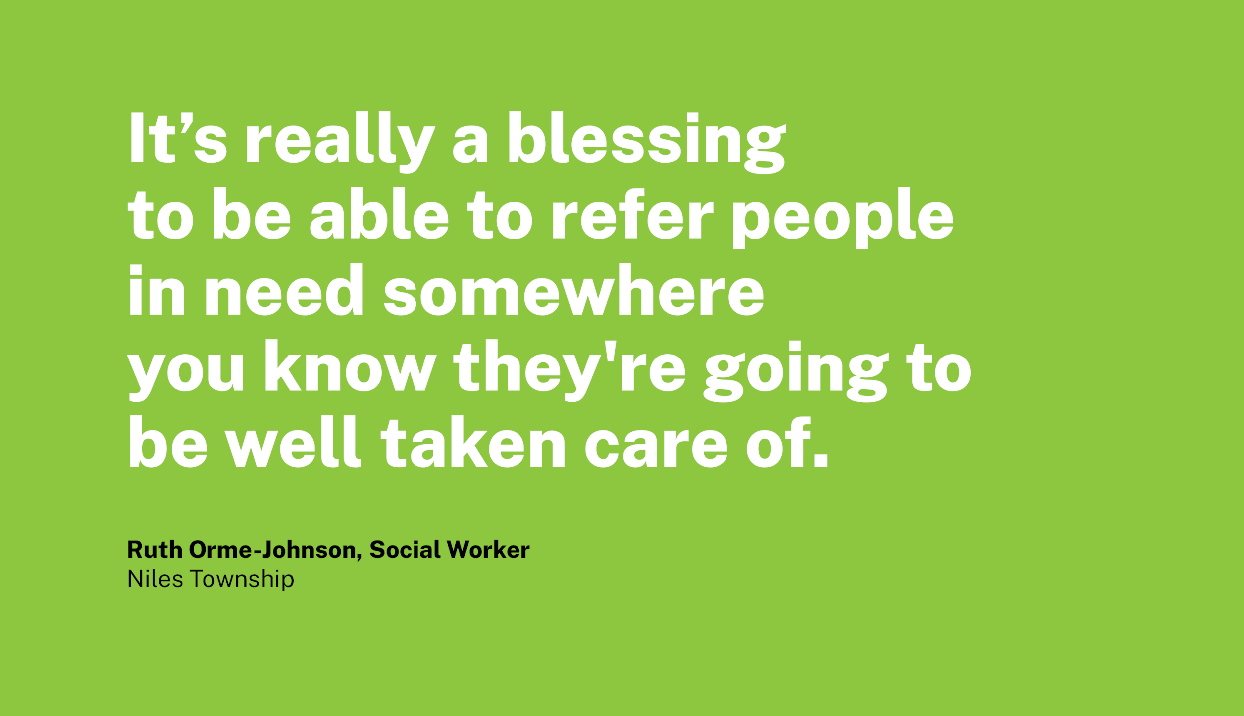
The response to this brand has been positive consistently and overwhelmingly, for many years. Among the most memorable comments are those from Turning Point clients and other key stakeholders made directly to us about the professionalism and dedication of the leadership and staff, the quality of care provided, and how welcome and at home they feel in the spaces we helped to create for them.